CSS
date
Jan 9, 2022
type
KnowledgeBase
year
slug
css
status
Published
tags
CSS
summary
A quick and simple guide to the basics of Cascading Style Sheets (CSS)
CSS is a style sheet language.
Lets you selectively style HTML elements
For example: color all
<p> elements red:Selectors
Universal:
* matches everythingElement:
input will match any <input> elementClass:
.classname will match any element that has class="classname"ID:
#blah will match the element that has id=blahAttribute:
[autoplay] will match all elements that have the autoplay attribute set (to any value)Grouping:
div, span will match both <div> and <span> elementsDescendent:
div span will match all <span> elements that are inside a <div>Child:
ul > li will match all <li> elements that are nested directly inside a <ul> elementSibling:
p ~ span will match all <span> elements that follow a <p>, immediately or not Adjacent Sibling:
h2 + p will match the first <p> element that immediately follows an <h2>Column:
col || td will match all <td> elements that belong to the scope of the <col>What can you style?
So many things! From
background-color, over text-align and font-family to border-widthBest look it up in a long list like this: 🌐 → https://www.w3schools.com/css/default.asp
Box Model
There’s an invisible box that wraps around every HTML element.
In the center there’s your content, then add padding, border and margin.
If you set the width/height of an element you’re only setting the width/height of the content - padding, border and margin add to that!

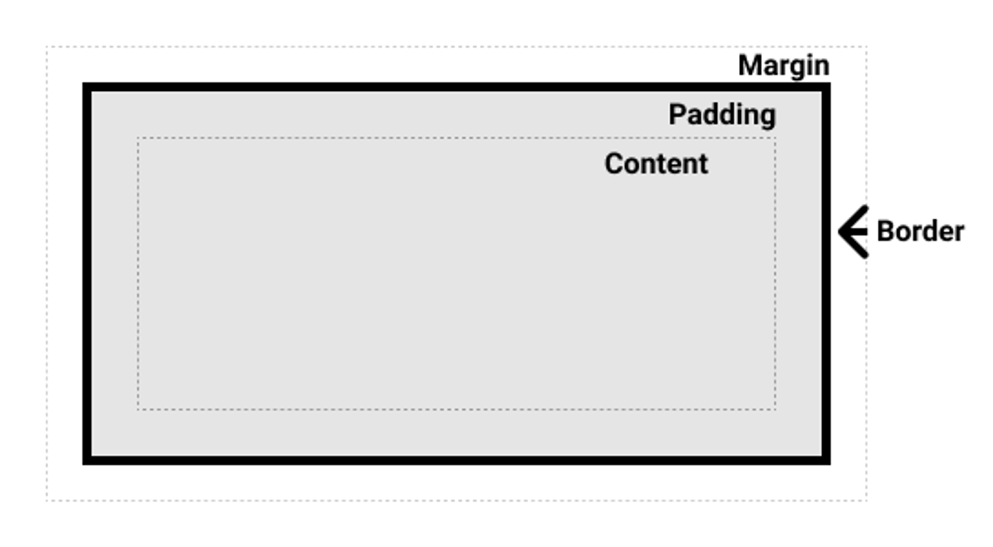
Note that there is also
outline, which is drawn outside the border and does not add to the width/height (it’s used for highlighting an element)Flexbox
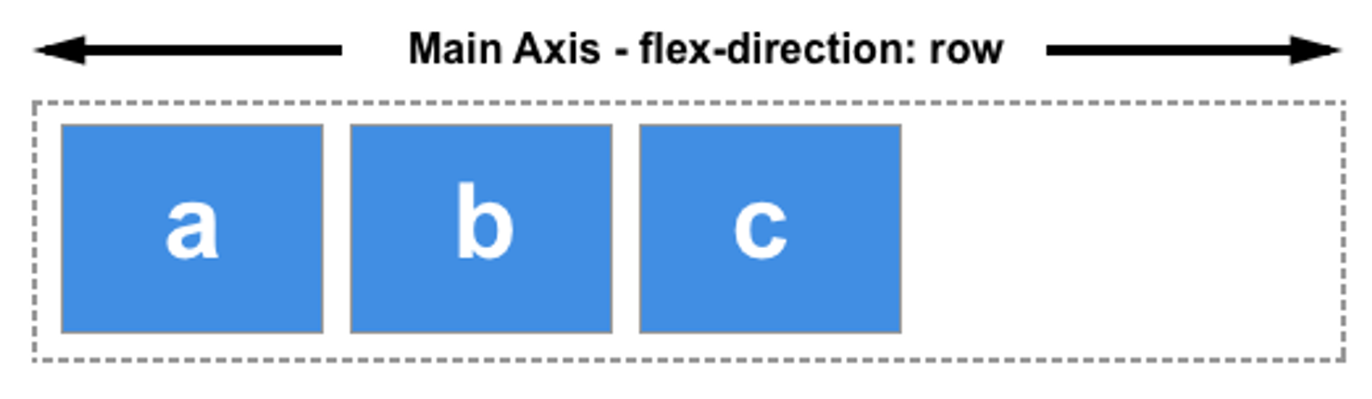
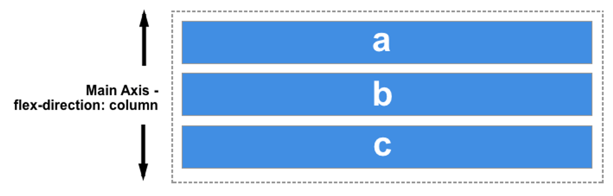
Designed to offer space distribution between items in an interface and powerful alignment capabilities.
To create a flex container:
display: flex or display: inline-flex - then all its children will be flex itemsIt’s 1-dimensional in so far as it deals with layout in one dimension at a time. First the main axis, then the cross axis.
Main axis -
flex-directionroworrow-reverse

columnorcolumn-reverse

Cross Axis is the perpendicular axis to the chosen main axis.
Start and End lines - based on writing modes - if your on English, then start is left. if you’re working in Arabic, then start is on the right and end is on the left.
Wrapping:
flex-wrapflex-direction: row and flex-wrap: wrap can be combined into flex-flow: row wrap, etc.Filling available space:
flex-basis: auto, flex-basis: 200px - set initial main size of a flex item.flex-grow: 1, flex-grow: 3 - grow factor of a flex item. specifies how much of the remaining space in the flex container should be assigned to the item. If all sibling items have the same flex grow factor, then all items will receive the same share of remaining space, otherwise it is distributed according to the ratio defined by the different flex grow factors.flex-shrink: 0, flex-shrink: 1 - shrink factor. If the size of all flex items is larger than the flex container, items shrink to fit according to flex-shrink
These 3 can be combined into shorthand flex: 1 1 auto (grow, shrink, basis)Predefined shorthand values that cover most cases:
flex: initial- same asflex: 0 1 auto
flex: auto- same asflex: 1 1 auto
flex: none- same asflex: 0 0 auto
flex: <positive-number>-flex: 2is the same asflex: 2 1 0
Alignment
align-itemsalign-items: stretch- stretch to height of container
align-items: flex-start- line up at the start (top left in english)
align-items: flex-end- line up at the end (bottom right in english)
align-items: center- if direction is row, then it vertically aligns it in the center. if it’s row it’s horizontal center.
Extensions